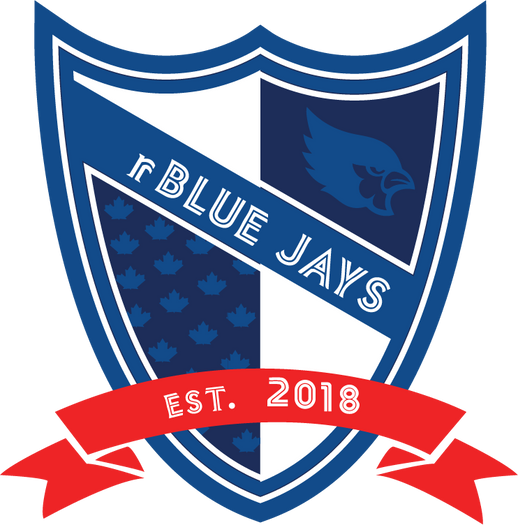
rBlue Jays

The rBlue Jays are one of 30 franchises exclusive to the Virtual Baseball League (VBL). The VBL was designed to mirror the Major League Baseball's behind the scenes operations with a goal of providing aspiring baseball professionals the opportunity to own and operate a team.
My job was to design a logo that communicated a sense of professionalism and elegance in a world of sports logos and mascots that tended to lack seriousness, and instead came across as silly and cartoonish.
The crest was the foundation of the design, giving it a historic and almost regal feel. Birds are a common theme in sports (blue jays, cardinals, orioles etc.) and it was important for the design of our blue jay to be original, and clearly differentiate itself from others commonly seen in the industry.
But, we still had fun pulling inspiration from familiar elements like the Toronto Blue Jays font, and Toronto Maple Leaves iconic maple leaf!
Testimonial
"I was searching for a graphic designer to help me create logo concepts for a business I was starting. I reached out to Ethan based on a recommendation from a mutual friend. I had a logo concept in mind but wasn't necessarily sure exactly what direction I wanted to go. Ethan spent a ton of time with me going over my vision and design concepts.
After each round of designs he carefully listened and applied all of my recommendations without hesitation. I was extremely satisfied with his work and the finished product. I've reached out to Ethan various times since we first worked together for additional help and tweaks - he's always been receptive and prompt in his responses. You will not be disappointed if you work with Ethan!"
- Jackson McDonnell, rBlue Jays Owner & Founder

This was the first iteration of our design. Although I really love this logo, the client and I both agreed that it still emulated a bit of that "cartoonish" feel that we were looking to outgrow.
With this in mind, I toned down some of the more outlandish elements like the points at the top of the crest and the flashy red banner which helped create a more stoic and serious tone.
This was also when I did a complete overhaul of the blue jay specifically to get the unique design we were looking for.
This was great experience working through multiple design iterations with the client until the end result was exactly what they desired.
